Smart Start Rowan gets new logo, new look
Published 12:00 am Thursday, May 11, 2017
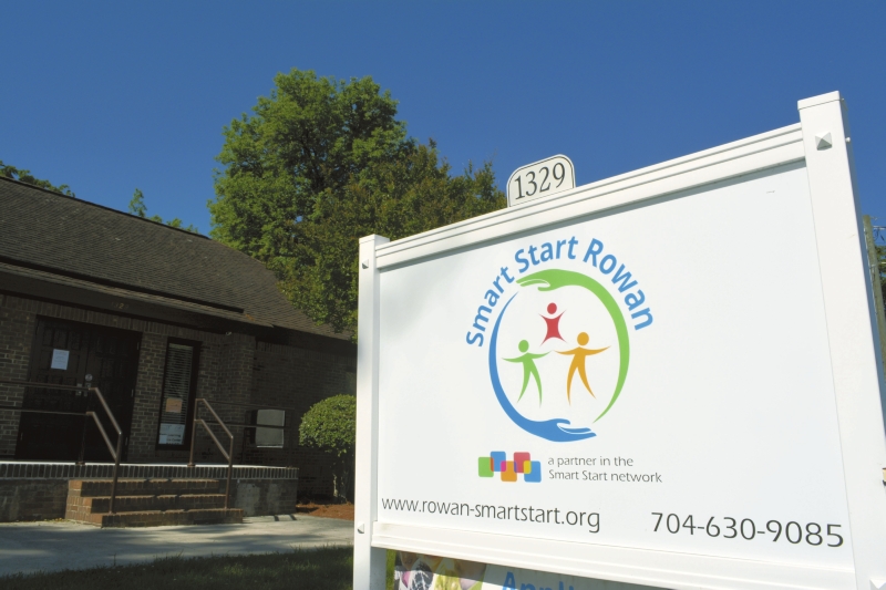
- Smart Start Rowan's office.
By Susan Shinn Turner
Smart Start Rowan
SALISBURY — Every few years, most businesses update their logos as part of their rebranding strategy.
Smart Start Rowan is no different. The local agency, which serves children ages birth to 5, unveiled a new logo last month at the Shirley P. Ritchie Champion for Young Children event at Catawba College.
Its redesign was long overdue, says Amy Brown, Smart Start Rowan’s executive director.
“Our original logo had been redone when we transitioned from Rowan Partnership for Children to Smart Start Rowan,” she said. “It was essentially the same logo, so we needed a more contemporary look. Part of our three-year strategic plan is to start a rebranding process. It was a good time to get it done and approved by our board so we could unveil it at our annual event.”
The timing coincided with the new logo created by the N.C. Partnership for Children, Brown said. “We wanted to see what their logo looked like and what their recommendations would be for our new logo.”
To create consistency and brand recognition statewide, Brown said, all Smart Start Partnerships across the state use the tagline “A Partner in the Smart Start Network,” which was included in the new local logo.
The logo incorporates bright, primary colors found in the state logo.
“We had a lot of leeway as to how we could make it work,” Brown said. “We considered a lot of options.”
The local logo was fashioned around family. It shows two parents lifting a child, and the three of them are encircled by a set of hands. The logo was created in-house by Cinthia Rodriguez, N.C. pre-K coordinator, with input from staff and from the agency’s Community Relations Committee, which had been chaired by Jane Welch.
The original logo featured a parent and a child holding hands and incorporated shades of blue and gray.
“Our committee wanted the symbol of a family, but with no particular gender represented,” Rodriguez said. “We started with the family, with two figures, and incorporated a child. Then we used the symbol of the hands encircling that family, because we have the support of the whole community, with family, friends and neighbors, in raising these children. Then I plugged in the colors from the N.C. Partnership for Children logo.”
With feedback from the committee and staff, the process took about seven months. Rodriguez said she worked on the logo for a couple of hours each month during that time.
“I love it,” she said. “I love the colors, and I love that it’s more modern and more inviting. You really want to know more about what our agency is about.”
“When we were looking at redesigning, we wanted to make sure the logo was inclusive of all families, not just the traditional family,” said Laura Villegas, director of programs. “We serve single parents, grandparents raising grandchildren, and families of color with different languages and different cultures. We wanted to find something that represents all of that.”
Villegas also likes the circle of hands in the logo, another symbol of the inclusive and ever-changing role of the agency.
As part of the rebranding effort, the agency is in the process of redesigning its website.
“It all needs to match up,” Brown noted. “To truly rebrand, everything has to align.”
Staff members will update the logos on its videos and PowerPoint presentations. With social media, Brown said, logos are more visible than ever and need occasional updates. The agency is in the process of changing its signage, stationery, name badges, shirts, business cards and more to reflect the new logo.
“It just gives us a fresh, new look,” Brown said.
Smart Start Rowan is a United Way member agency.


